Cairo – Navigating Communities
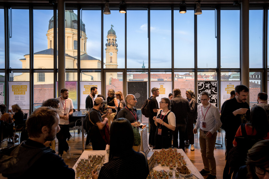
Typographers, designers, calligraphers, historians of writing and scripts met for two days of intensive discussions and debates. In fact, this is the first time that the Granshan Conference has been held in Egypt. It was a good effort and an excellent idea of Haytham Nawar and Bahia Shehab to take the initiative to bring it to Cairo. It is also an opportunity to bring local partners face to face with their counterparts from different countries and perspectives.
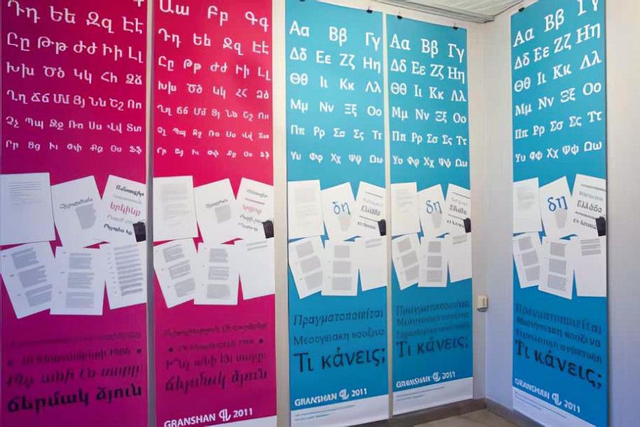
Granshan runs annually as a competition for Type Design for non-Latin typefaces. Every year, the organizing committee chooses a city to organize the competition. Besides, a scholarly conference is organized to storm brain about the new visions, ideas, projects, updates on switching between design and original types. The conference is focused on the technical challenges by the integration of Non-Latin typefaces – and on writing systems like Cyrillic, Greek, Arabic, Indian and of course Armenian.
This year’s Granshan conference focused on sharing and learning about designing for atmospheres that respect complex social and personal cultural histories and respond to a world that is at once more interconnected and more intimate. Granshan Cairo successfully navigated communities to develop design culture and enterprise in a balance between local, regional and global. It also discussed how design can transform communities, give focus to businesses and underpin regional identities.
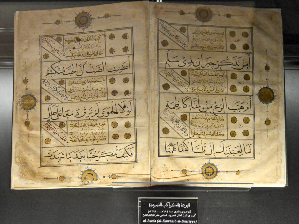
The conference sessions were each dedicated to a theme exploring a particular area of research. The opening session was dedicated to discovering and tracing the evolution of the Arabic script either historically, paleographically or visually. Prof. Kamal Mansour, with his 20 years at Monotype and his involvement in the many challenges of typography and typeface development for many languages, took us on a long journey with the Arabic typeface. Prof. Mansour gave a workshop on encoding the Arabic language into the Unicode standard. He explained how OpenType is used as an international standard that provides all the necessary building blocks for the visual representation of different styles of Arabic script.
Then, an impressive contribution was dedicated to hear more about the new trends of learning Arabic script and calligraphy in different countries such as Lebanon and Morocco.
The revival of Arabic script on different media was an important case to be raised in this meeting. For example: shop signs, airport signs, road signs, … reflected the importance of Arabic typography. The bilingual (Arabic-English) typographic applications in terms of font selection, treatment, hierarchy, layout, and reading direction, within the context of print, should be examined. The combination of both scripts in a single publication, and highlights the active role of the designer in determining the relationship between these two scripts that represent two different languages (and cultures). This was made clear in the Converse Between Two Worlds presentation, which showed a short film about crossing typographic boundaries and how innovation can emerge from these challenging intersections.
In the same frame, Bahia Shehab showed us the real history of opposition in Arab society by tracing the history of »Lam-Alif«, which means »No«. This word was written in different forms and designs to express disagreement with the general policies of the state. Shehab collected different examples from different historical periods.
Gradually, the conference began to show its identity. Speakers were more focused on showing their attempts to develop and sail through different communities and environments. Yara Khoury discussed in detail Nasri Khattar’s attempts to unify the Arabic type as a reform concept in the 1940s. Yara also organized a workshop on 3D Arabic type. Participants learned about the main parameters that define the Arabic script and letterforms, and played around with them to see the different results that can be generated from 2D to 3D.
Meanwhile, Ali el-Masry told the story of his typeface, which has its own history, a name, an inspiration, an ambition, and a series of trials and errors it has gone through.
Starting from the second half of the second day of the conference, imperative debates came to light. Edik Ghabuzyan presented a historical overview of the Armenian script and printing. The passion for the Armenian script is intrinsic to the Armenian culture.
In an innovative interaction, Haytham Nawar interviewed Thomas Milo on Qur’anic and biblical publications to witness a comprehensive elaboration on the comparison between calligraphy and typography. Milo’s presentation on the history of Qur’anic printing in the modern era was very rich.
The limited use of typefaces came to light, such as Coptic and Tifinagh. It’s an ancient North African writing system and script. Its alphabet is officially recognized by IRCAM Morocco and adopted by the Libyan Minister of Education. Madgis Madi showed its artistic use as well as its everyday use in worldwide logos and trademarks. On the other hand, Romany Hafez explored the origins of the Coptic script and its current use in Egyptian society. However, he regretted the absence of a Coptic font that attracts designers. Hafez suggested that the Coptic script be included in the Granshan competition.
Finally, Ahmed Mansour, Deputy Director of the Bibliotheca Alexandrina Calligraphy Center, presented an important project on »The Journey of Writing in Egypt«. It is a long-term academic project that aims to research, document, and then preserve writing in Egypt from the protodynastic period to the modern era. In addition, Mansour shed light on the importance of ancient writings in documenting the lives of foreign communities living in Egypt. He added an important note that these scripts could inspire typographers to design new typefaces from the different alphabets found in Egypt throughout its history.
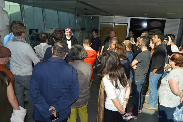
It is worth mentioning that the participants paid a visit to the Bibliotheca Alexandrina to visit the Bulaq Press Museum, which was established about 10 years ago to tell the story of the first government printing press in Egypt.
In conclusion, Granshan Cairo is actually an enthusiastic gathering of calligraphers, type designers, specialists in the history of writing, developers and programmers to meet, discuss and debate on the best solution to reform the scripts in typography. This assembly could bring together the local partners from Egypt AUC and Bibliotheca Alexandrina Calligraphy Centre together with international partners: Armenian Ministry of Culture, Kochan & Partner and Monotype, … etc.
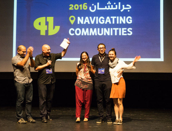
- Als Gastautor fasste Dr. Ahmed Mansour die Ergebnisse der Konferenz für uns zusammen. Er ist stellvertretender Direktor des Bibliotheca Alexandrina Calligraphy Centre. Seine Forschungsschwerpunkte sind die arabische Schrift- und Druckgeschichte. Zusammen mit Dr. Khaled Azab hat er das Buch »The Bulaq Press« über die erste staatliche Druckerei Ägyptens und ihren Einfluss auf die gesellschaftliche Entwicklung veröffentlicht.
Weitere Blogbeiträge, die Sie interessieren könnten
Bei den schriftbesessenen alten Ägyptern
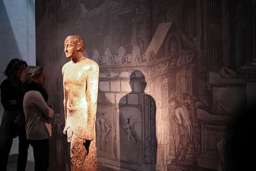
Die Typografische Ortsbesichtigung im neuen Ägyptischen Museum war bald nach dem Anmeldestart ausgebucht. Die hohen Erwartungen der Teilnehmer wurden durch die Führungen von Dr. Sylvia Schoske, Prof. Dr. Dietrich Wildung und Christian Raißle mehr als erfüllt. Die Erläuterungen aus unterschiedlichen Perspektiven (Kunst, Architektur, Design) machten das Gesamtkonzept des Museums auf eine spannende und kurzweilige Art und Weise verständlich und erlebbar.
Jerusalem, zweiter Tag
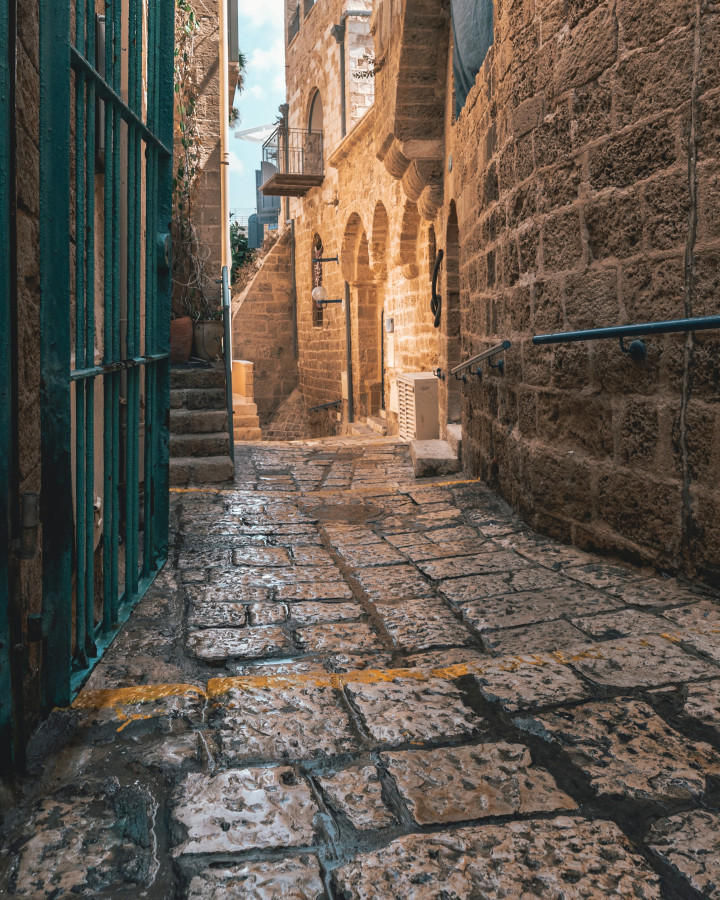
Das Österreichische Hospiz, in dem die meisten von uns übernachten, liegt mitten in der Altstadt und ist eine wunderbare Oase der Ruhe, etwas burgartig gebaut. Frühmorgens hört man die Hähne krähen oder den Muezzin rufen, je nach Lage des Zimmers.
Dresden, Halle, Dessau und Leipzig
Anfang November 2012 begab sich eine 17-köpfige Reisegruppe auf Spurensuche zu wichtigen Stationen der Typografie- und Designgeschichte in Dresden, Halle, Dessau und Leipzig. Anhand einiger Bilder möchten wir die Stationen dieser schönen Reise beschreiben – ein Foto-Reisetagebuch.

Signs of the times
Die zweitägige Granshan-Konferenz fand im Literaturhaus mit seinem überwältigenden Panorama über München statt. Auf der Bühne war das beherrschende Motiv der Berg Ararat. Dieses armenische Wahrzeichen verwies auf den Beginn der Idee, das sich mit nicht-lateinischen Schriften zu beschäftigen.
